CREATION IS MESSY COLOR TESTING FEBRUARY 2018
MESSY COLOR™ 464 CAMOUFLAGE LTD RUN 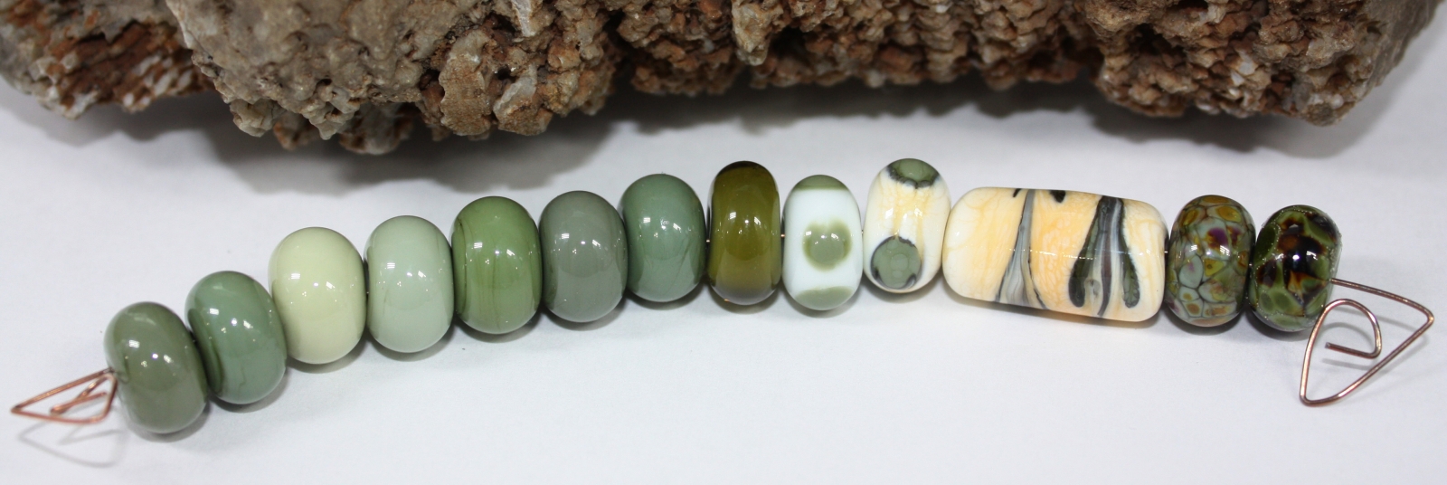
FROM LEFT TO RIGHT:
MESSY COLOR™ 464 CAMOUFLAGE LTD RUN
MESSY COLOR™ 403 ARMY MEN LTD RUN
MESSY COLOR™ 418 LICHEN LTD RUN
MESSY COLOR™ 434 EUCALYPTUS LTD RUN
MESSY COLOR™ 436 LEAF MEN LTD RUN
MESSY COLOR™ 455 TROLL LTD RUN
MESSY COLOR™ 475 COMMANDO
MESSY COLOR™ 464 CAMOUFLAGE LTD RUN ENCASED WITH MESSY COLOR™ 452 PEAT MOSS LTD RUN
MESSY COLOR™ 835 PEACE WITH MESSY COLOR™ 464 CAMOUFLAGE LTD RUN DOTS
EFFETRE™ P-276 DARK IVORY WITH MESSY COLOR™ 464 CAMOUFLAGE LTD RUN DOTS
MESSY COLOR™ 464 CAMOUFLAGE LTD RUN WITH THAT FRIT GIRL KALERA’S ROMANCE FRIT BLEND
MESSY COLOR™ 464 CAMOUFLAGE LTD RUN WITH SILVER FOIL WITH GLASS DIVERSIONS SAVANNAH FRIT MIX
Camouflage melted smoothly with no shockiness or bubbles. It is a new color to the 104 palette. It is similar to Army Men, Leaf Men, and Troll, but just a bit different in color to each of those. It is a beautiful color. It made a really nice olive green encase with Peat Moss. There was no reaction on the Peace, but on the Dark Ivory there was a darker line around each of the Camouflage dots. With the reaction I created another Dark Ivory bead with dots of Camouflage dots raked, there was a very pleasing reaction once again on the Dark Ivory. The Kalera’s Romance frit and silver foil with Savannah frit both created nice organic colored beads. I believe that etching especially the Kalera’s Romance on the Camouflage would be beautiful.
MESSY COLOR™ 912 LILAC LTD RUN 
FROM LEFT TO RIGHT:
MESSY COLOR™ 912 LILAC LTD RUN
EFFETRE™ P-260 LIGHT PINK (BUBBLEGUM)
MESSY COLOR™ 957 DESERT PINK
MESSY COLOR™ 902 PRIMROSE
EFFETRE™ P-261 ROSA P D’ANGELO
MESSY COLOR™ 912 LILAC ENCASED WITH MESSY COLOR™ 911 VENUS LTD RUN
MESSY COLOR™ 872 TUXEDO WITH MESSY COLOR™ 912 LILAC LTD RUN DOTS
EFFETRE™ P-284 BLACK IVORY WITH MESSY COLOR™ 912 LILAC LTD RUN DOTS
EFFETRE™ P-272 DARK IVORY WITH MESSY COLOR™ 912 LILAC LTD RUN DOTS
MESSY COLOR™ 912 LILAC LTD RUN WITH THAT FRIT GIRL KALERA’S ROMANCE FRIT BLEND
MESSY COLOR™ 912 LILAC LTD RUN WITH SILVER FOIL WITH DRAGONFLY GLASSWORX ZEN GARDEN FRIT BLEND
Lilac melted smoothly with no shockiness or bubbles, and reactive with some colors. It is a new color to the 104 palette. It is similar to Effetre Light Pink (Bubblegum), but a bit more lavender. It is also a bit of a color shifter; when photographed in inside light it is more pink and outside light more lavender. Encased with Venus it is a fabulous bright beautiful pink. I was surprised to see a color reaction with the Tuxedo, Black Ivory and Dark Ivory, there was a little ring created around each dot. With Kalera’s Romance frit it created nice organic colored bead with lovely pops of purple. Using silver foil and the Zen Garden frit the frit spread beautifully creating a pretty organic colored bead. I would imagine that without the silver foil that it would be a very pretty pastel colored bead.
MESSY COLOR™ 729 SERENGETI LTD RUN 
FROM LEFT TO RIGHT:
MESSY COLOR™ 729 SERENGETI LTD RUN
MESSY COLOR™ 728 CANOE LTD RUN
MESSY COLOR™ 720 AUTUMN LTD RUN
MESSY COLOR™ 729 SERENGETI LTD RUN
MESSY COLOR™ 728 CANOE LTD RUN
MESSY COLOR™ 729 SERENGETI LTD RUN ENCASED WITH MESSY COLOR™ 780 MAPLE
MESSY COLOR™ 835 PEACE WITH MESSY COLOR™ 729 SERENGETI LTD RUN DOTS
EFFETRE™ P-276 DARK IVORY WITH MESSY COLOR™ 729 SERENGETI LTD RUN DOTS
MESSY COLOR™ 729 SERENGETI LTD RUN WITH THAT FRIT GIRL KALERA’S ROMANCE FRIT BLEND
MESSY COLOR™ 729 SERENGETI LTD RUN WITH SILVER FOIL WITH HOWACO CALICO FRIT
Serengeti melted smoothly with no shockiness or bubbles. It is a new color to the 104 palette. It is similar to Canoe, but with a more red saturation compared to a more golden tone with the Canoe and much darker than Autumn. It is a beautiful color. I can see using it for a great color for animal fur for foxes, horses, dogs, etc. Encased with Maple (one of my favorite colors) it in a nice shiny shade of golden brown. The Kalera’s Romance frit and silver foil with Calico frit both created nice organic colored beads. I will be using it as a nice base for frit, as the colors turned out fabulous.
MESSY COLOR™ 316 BANANA CREAM LTD RUN 
FROM LEFT TO RIGHT:
MESSY COLOR™ 316 BANANA CREAM LTD RUN
MESSY COLOR™ 313 PAINTED HILLS
MESSY COLOR™ 315 BUTTERMILK
MESSY COLOR™ 307 CAKE BATTER
MESSY COLOR™ 314 CORNSILK
MESSY COLOR™ 316 BANANA CREAM ENCASED WITH MESSY COLOR™ 303 LEMON DROP LTD RUN
MESSY COLOR™ 872 TUXEDO WITH MESSY COLOR™ 316 BANANA CREAM LTD RUN DOTS
EFFETRE™ P-284 BLACK IVORY WITH MESSY COLOR™ 316 BANANA CREAM LTD RUN DOTS
MESSY COLOR™ 316 BANANA CREAM LTD RUN WITH THAT FRIT GIRL KALERA’S ROMANCE FRIT BLEND
MESSY COLOR™ 316 BANANA CREAM LTD RUN WITH SILVER FOIL WITH THAT FRIT GIRL I PINE FOR YOU FRIT BLEND
EFFETRE™ P-219 COPPER GREEEN WITH A TWISTY OF MESSY COLOR™ 316 BANANA CREAM LTD RUN AND REICHENBACH R2202 PURPLE ROSE
Banana Cream melted smoothly with no shockiness, and no bubbles. It is a new color to the 104 palette. It is similar to Painted Hills, but Banana Cream is a bit more creamy yellow compared to the bit more golden hue of the Painted HIlls. Encased with Lemon Drop it is very pretty and has some rosy hue spots on it. It is a gorgeous butter yellow hue on both the Tuxedo and the Black Ivory. With Kalera’s Romance frit it created a delicious colored bead, with purple pops with butter yellow. With silver foil and the I Pine for You creating a very pretty base for this frit. I was hoping for a different reaction on the Copper Green with a twisty of Banana Cream and Purple Rose, unfortunately I did not get the result I was hoping for, but it still created a pretty bead. I definitely see more Banana Cream glass in my future.
MESSY COLOR™ 465 OOBLECK LTD RUN 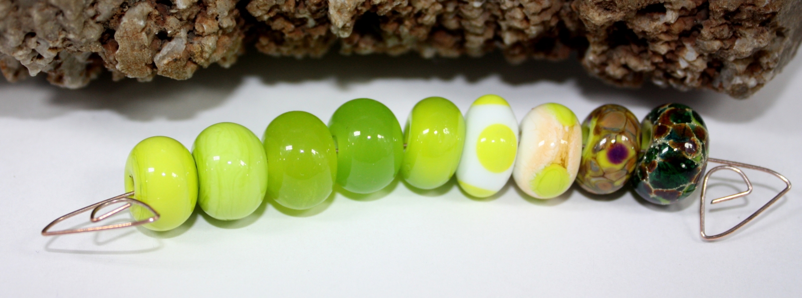
FROM LEFT TO RIGHT:
MESSY COLOR™ 465 OOBLECK LTD RUN
EFFETRE™ P-212 PEA GREEN
MESSY COLOR™ 450 CHARTREUSE
MESSY COLOR™ 461 JELLY BEAN
MESSY COLOR™ 465 OOBLECK ENCASED WITH MESSY COLOR™ 461 JELLY BEAN LTD RUN
MESSY COLOR™ 835 PEACE WITH MESSY COLOR™ 465 OOBLECK LTD RUN DOTS
EFFETRE™ P-276 DARK IVORY WITH MESSY COLOR™ 465 OOBLECK LTD RUN DOTS
MESSY COLOR™ 465 OOBLECK LTD RUN WITH THAT FRIT GIRL KALERA’S ROMANCE FRIT BLEND
MESSY COLOR™ 465 OOBLECK LTD RUN WITH SILVER FOIL WITH GLASS DIVERSIONS BOLLYWOOD FRIT BLEND
Oobleck melted smoothly with no shockiness, and very small amount of bubbles. It is a new color to the 104 palette. It is similar to Pea Green, but Oobleck is brighter and more yellow in tone than Pea Green. Encased with Jelly Bean it is a spectacular shade of chartreuse / lime green. It really pops on both the Peace and Dark Ivory. It was a superb base for the Kalera’s Romance frit blend. Oobleck with silver foil and Bollywood is very nice with lovely tones of red brown, dark greens, and Lime Green. This is a lovely bright, bright green that I am going to want more of.
MESSY COLOR™ 555 SACRE BLEU LTD RUN 
FROM LEFT TO RIGHT:
MESSY COLOR™ 555 SACRE BLEU LTD RUN
MESSY COLOR™ 500 AZURE LTD RUN
MESSY COLOR™ 524 NEON BLUE LTD RUN
EFFETRE™ T-057 TRANSPARENT INTENSE BLUE
EFFETRE™ T-060 TRANSPARENT COBALT BLUE
MESSY COLOR™ 505 FRENCH BLUE ENCASED WITH MESSY COLOR™ 555 SACRE BLEU LTD RUN
MESSY COLOR™ 835 PEACE WITH MESSY COLOR™ 555 SACRE BLEU LTD RUN DOTS
EFFETRE™ P-276 DARK IVORY WITH MESSY COLOR™ 555 SACRE BLEU LTD RUN DOTS
MESSY COLOR™ 555 SACRE BLEU LTD RUN WITH THAT FRIT GIRL KALERA’S ROMANCE FRIT BLEND
MESSY COLOR™ 555 SACRE BLEU LTD RUN WITH SILVER FOIL WITH DRAGONFLY GLASSWORX DANCING DREAMER FRIT BLEND
Sacre Bleu melted smoothly with no shockiness or bubbles. It is a new color to the 104 palette. It is similar to Azure, Neon Blue, Royal, Intense Blue, and Cobalt Blue, but the saturation of each is just a bit different. It is a gorgeous blue color. It was so pretty on both the Peace and the Dark Ivory. It looked about the shade of cornflower blue on the Peace and more of a light royal blue on the Dark Ivory. With Kalera’s Romance frit it created nice organic colored bead. With silver foil and the Dancing Dreamer Frit the bead is stunning, what a great base with silver foil for Dancing Dreamer.
MESSY COLOR™ 556 MERRYWEATHER LTD RUN 
FROM LEFT TO RIGHT:
MESSY COLOR™ 556 MERRYWEATHER LTD RUN
MESSY COLOR™ 547 ELECTRIC AVENUE
MESSY COLOR™ 598 ATLANTIS
EFFETRE™ A-352 ALABASTER MEDIUM TURQUOISE
EFFETRE™ A-356 ALABASTER DARK TURQUOISE
MESSY COLOR™ 503 MINT LOZENGE
MESSY COLOR™ 509 POSEIDON
MESSY COLOR™ 556 MERRYWEATHER ENCASED WITH MESSY COLOR™ 563 PULSAR
MESSY COLOR™ 835 PEACE WITH MESSY COLOR™ 556 MERRYWEATHER LTD RUN DOTS
EFFETRE™ P-276 DARK IVORY WITH MESSY COLOR™ 556 MERRYWEATHER LTD RUN DOTS
MESSY COLOR™ 556 MERRYWEATHER LTD RUN WITH THAT FRIT GIRL KALERA’S ROMANCE FRIT BLEND
MESSY COLOR™ 556 MERRYWEATHER LTD RUN WITH SILVER FOIL WITH GLASS DIVERSIONS SECLUDED GLADE FRIT BLEND
Merryweather melted smoothly with no shockiness or bubbles. It is a new color to the 104 palette. It is similar to Electric Avenue, but a bit less saturated. It is also close in color to the Alabaster Dark Turquoise, but without the nasty bubbling and no need to work it extremely cool. Merryweather encased with Pulsar is a beautiful aquamarine shade. It is gorgeous shade of light aqua on Peace and a more turquoise color on Dark Ivory. On the Dark Ivory it has a dark rim around the dot from a color reaction. It was a pretty base for the Kalera’s Romance frit blend with organic colors. Merryweather with silver foil and Secluded Glade is very pretty with green and rosy brown shades.
MESSY COLOR™ 466 AMPHIBIAN LTD RUN 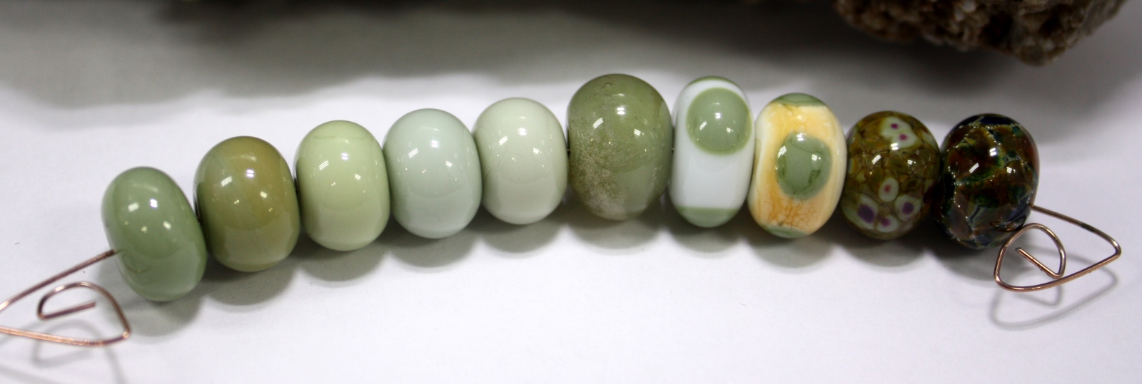
FROM LEFT TO RIGHT:
MESSY COLOR™ 466 AMPHIBIAN LTD RUN
MESSY COLOR™ 429 TORTOISE LTD RUN
MESSY COLOR™ LICHEN LTD RUN
MESSY COLOR™ 448 DIRTY MARTINI
MESSY COLOR™ 440 PISTACHIO ICE CREAM LTD RUN
MESSY COLOR™ 466 AMPHIBIAN LTD RUN ENCASED WITH MESSY COLOR™ 457 YANGTZE LTD RUN
MESSY COLOR™ 835 PEACE WITH MESSY COLOR™ 466 AMPHIBIAN LTD RUN DOTS
EFFETRE™ P-276 DARK IVORY WITH MESSY COLOR™ 466 AMPHIBIAN LTD RUN DOTS
MESSY COLOR™ 466 AMPHIBIAN LTD RUN WITH THAT FRIT GIRL KALERA’S ROMANCE FRIT BLEND
MESSY COLOR™ 466 AMPHIBIAN LTD RUN WITH SILVER FOIL WITH BEAD GOODIES SUMMER SPICE FRIT BLEND
Amphibian melted smoothly with no shockiness or bubbles. It is a new color to the 104 palette. It is similar to Tortoise, but more green. Amphibian encased with Yangtze is a very nice Army Green color. It stands out nicely on Peace as a nice Slate Green Amphibian on Dark Ivory has a nice unique ring around the outside of each dot. It was a pretty base for the Kalera’s Romance frit blend with lovely pops of purple surrounded by olive green. Amphibian with silver foil and Summer Spice frit blend is very pretty with Teal and Brown pools surrounded by rings of silver.
MESSY COLOR™ 557 SERENITY LTD RUN 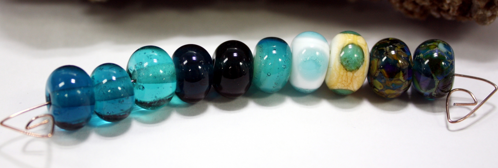
FROM LEFT TO RIGHT:
MESSY COLOR™ 557 SERENITY LTD RUN
MESSY COLOR™ 534 AEGEAN
MESSY COLOR™ 553 POOLSIDE LTD RUN
MESSY COLOR™ 522 TUSCAN TEAL LTD RUN
MESSY COLOR™ 590 GREAT BLUEDINI
MESSY COLOR™ 449 KRYPTONITE ENCASED WITH MESSY COLOR™ 557 SERENITY
MESSY COLOR™ 835 PEACE WITH MESSY COLOR™ 557 SERENITY LTD RUN DOTS
EFFETRE™ P-276 DARK IVORY WITH MESSY COLOR™ 557 SERENITY LTD RUN DOTS
MESSY COLOR™ 557 SERENITY LTD RUN WITH THAT FRIT GIRL KALERA’S ROMANCE FRIT BLEND
MESSY COLOR™ 557 SERENITY LTD RUN WITH SILVER FOIL WITH GLASS DIVERSIONS POSEIDON FRIT BLEND
Serenity melted smoothly with no shockiness, and a small amount of bubbles. It is a new color to the 104 palette. It is similar to Aegean, but more saturated and slightly darker. Kryptonite is beautiful encased with Serenity, a beautiful light teal shade. It is gorgeous shade of light teal on Peace and a darker teal color on Dark Ivory. On the Dark Ivory it has a dark rim around the dot from a color reaction. It was a pretty base for the Kalera’s Romance frit blend with organic colors. Serenity with silver foil and Poseidon is very pretty with blues, greens, and browns.
MESSY COLOR™ 554 COTSWOLD BLUE LTD RUN 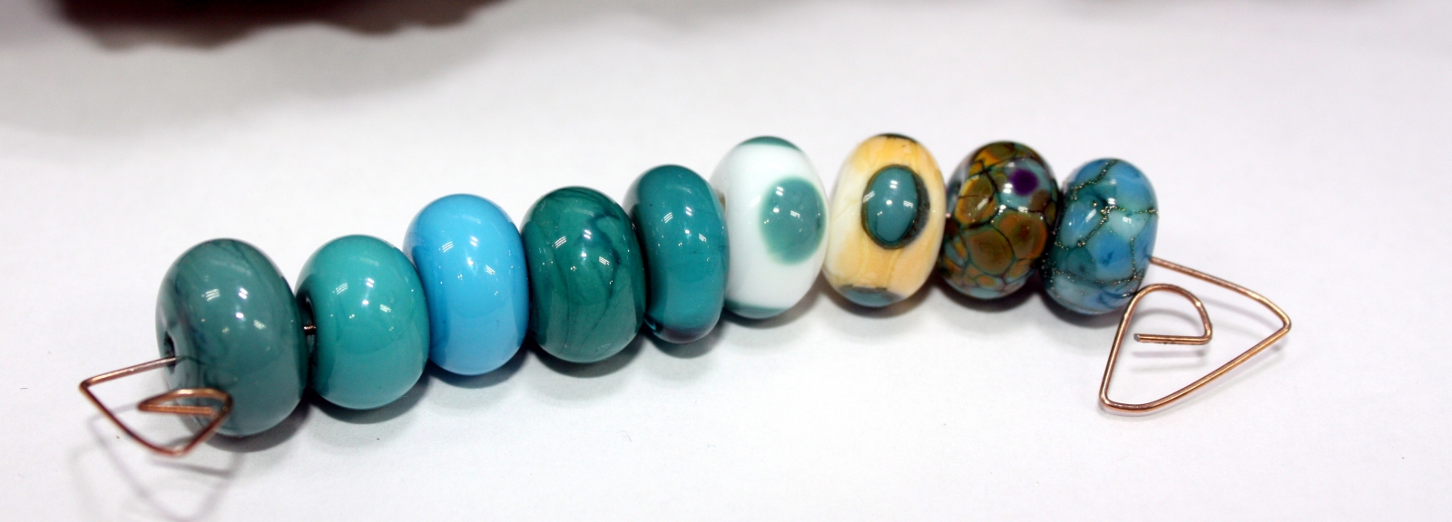
FROM LEFT TO RIGHT:
MESSY COLOR™ 554 COTSWOLD BLUE LTD RUN
MESSY COLOR™ 546 QUETZAL LTD RUN
MESSY COLOR™ 569 SMURFY
MESSY COLOR™ 586 MERMAID
MESSY COLOR™ 554 COTSWOLD BLUE WITH MESSY COLOR™ 534 AEGEAN LTD RUN
MESSY COLOR™ 835 PEACE WITH MESSY COLOR™ 554 COTSWOLD BLUE LTD RUN DOTS
EFFETRE™ P-276 DARK IVORY WITH MESSY COLOR™ 554 COTSWOLD BLUE LTD RUN DOTS
MESSY COLOR™ 554 COTSWOLD BLUE LTD RUN WITH THAT FRIT GIRL KALERA’S ROMANCE FRIT BLEND
MESSY COLOR™ 554 COTSWOLD BLUE LTD RUN WITH SILVER FOIL WITH THAT FRIT GIRL SANTA FE FRIT BLEND
Cotswold Blue melted smoothly with no shockiness or bubbles, and is reactive. It is a new color to the 104 palette. It is similar to Mermaid, but I did not get as many striations in the Cotswold Blue as with the Mermaid. Encased with Aegean it is very pleasing vibrant turquoise color. On the Dark Ivory there is a color reaction with a wonderful darker ring surrounding the dots. It is a nice base for Kalera’s Romance frit and creates a pretty organic colored bead. With silver foil and the Santa Fe frit blend it creates beautiful large puddles of white and turquoise surrounded by silver edges.
Tags
- Creation is Messy (3)
- Dark Ivory (3)
- Atlantis (2)
- Cotswold Blue (2)
- frit (2)
- Kalera's Romance Frit (2)
- Reichenbach Purple Rose (2)
- Venus (2)
- 104 COE (1)
- 104 COE color testing (1)
- 104 glass (1)
- Aegean (1)
- Alabaster Dark Turquoise (1)
- Alabaster Light Turquoise (1)
- Alabaster Medium Turquoise (1)
- Alley Cat (1)
- Allspice (1)
- Amphibian (1)
- Apricot Nectar Frit (1)
- Banana Cream (1)
- Blush (1)
- Butternut (1)
- Camouflage (1)
- Canoe (1)
- Celadon (1)
- Charlotte (1)
- Chartreuse (1)
- Chrysalis (1)
- CIM (1)
- Cirrus (1)
- Cookie Dough (1)
- Count Von Count (1)
- Creamsicle (1)
- Crocus (1)
- Daffodil (1)
- Dark Sky Blue (1)
- Dark Turquoise (1)
- Dark Yellow Orange (1)
- DH Okeanos (1)
- DH Zephyr (1)
- Electric Avenue (1)
- Enchanted (1)
- Flaming June (1)
- French Blue Frit (1)
- Galapagos (1)
- Gellys Sty (1)
- Glass (1)
- Glimmer Canyon Frit (1)
- Great Bluedini (1)
- Hazelnut Mousse (1)
- Heffalump (1)
- Inchworm (1)
- Iron Oxide (1)
- Jelly Bean (1)
- Jellyfish (1)
- Kismet Frit (1)
- Kiwi Squeeze Frit (1)
- Kryptonite (1)
- Lampwork (1)
- Lampwork beads (1)
- Larkspur (1)
- Lavender Water (1)
- Light Turquoise (1)
- Lilac (1)
- luna Blue (1)
- Maple (1)
- Maraschino (1)
- Marshmallow (1)
- Mermaid (1)
- Merryweather (1)
- Messy Color (1)
- Messy Color™ (1)
- Mink (1)
- Monarch (1)
- Oobleck (1)
- Opalino White (1)
- Opanlino Nile Green (1)
- Opaque Lavender (1)
- Opaque Teal (1)
- Oriental Blue Frit (1)
- Oscelot Spots Frit (1)
- Painted Hills (1)
- Pastel White (1)
- Peace (1)
- Petroleum Green (1)
- Phoenix Frit (1)
- Pink Champagne (1)
- Pink Taffy (1)
- Poison Apple (1)
- Poolside (1)
- Quetzal (1)
- Rapunzel (1)
- Red Lipstick (1)
- Sacre Bleu (1)
- Safari (1)
- Sakura (1)
- Serengegti (1)
- Serenity (1)
- Spearmint (1)
- Spooky (1)
- Stipple Stitch (1)
- Sugar Plum Fairy Frit (1)
- Tardis (1)
- Tawny White (1)
- Transparent Dark Lavender (1)
- Triton Frit (1)
- Troi (1)
- Tuscan Teal (1)
- Val Cox Flora (1)
- Val Cox frit (1)
- Van Dyke Brown (1)
- Viola Blue (1)
Archives
- January 2019 (1)
- June 2018 (1)
- February 2018 (1)
- January 2018 (1)
- September 2017 (1)


Comments
Errors corrected on testing
Errors corrected on testing write ups.
While most people think of
While most people think of art as being neat and tidy, the reality is that creation is often messy. This is especially true when it comes to color testing. Artists often have to try out real estate Temecula different colors and combinations before they find the perfect one for their project. This can create a lot of mess, but it's all worth it in the end when the perfect color is found.
hai
Contrary to popular belief, art is frequently chaotic; most people perceive it to be orderly and tidy. When it comes to colour testing, this is particularly diamonds rings near me accurate. Before settling on the ideal hue and mix for their work, artists frequently have to experiment.
hey
The detailed description of Banana Cream glass's behavior and color interactions is informative for glass artists. It's always valuable to share insights about how rheumatology clinic different glass types interact and create unique effects. The author's enthusiasm for using Banana Cream glass in future projects is palpable, offering inspiration for fellow artists.
What a beautiful exploration
What a beautiful exploration of color — this “messy color testing” feels wonderfully free and experimental! I love how you’re not afraid to try unexpected Retro Bowl 26 combinations and let the colors speak for themselves.
Thank you for sharing this —
Thank you for sharing this — it encourages me to loosen up in my own creative work and that's not my neighbor game embrace color without fear.
Irvin Robertson
A vibrant and inspiring look at Paula Dawne Creations—this messy color testing feels alive with experimentation. The focus on the Beth Dutton Handabg
Services
I love seeing the creative process in action! The color testing really shows how experimentation leads to unique and vibrant results. Messy or not, it’s inspiring to watch ideas come to life. Bitcoin Hyper Tokens
Wow, Serengeti sounds
Wow, Serengeti sounds intriguing! Does it really resist shocking as described? I found Canoe a bit temperamental in that regard; I preheated it for ages before using it with other glass to avoid cracks. Guess I'll be adding this one to the wish list. repo game anyone?
Post new comment