Creation is Messy Color Testing
I am so excited. I was able to test glass for Creation is Messy. I know it is a lot of work, but so very worth it. Plus, it will force me to actually blog again. I shut the site down for several months and lost all of my prior blogs. I guess it is time to get myself busy and doing something here.
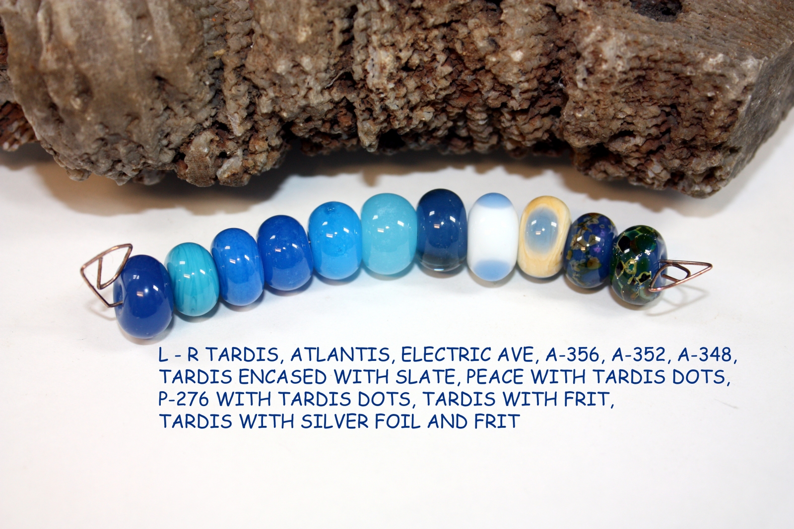
First up I have the new Messy Color™ TARDIS.
MESSY COLOR™ 552 TARDIS LTD RUN
FROM LEFT TO RIGHT:
MESSY COLOR™ 552 TARDIS LTD RUN
MESSY COLOR™ 598 ATLANTIS
MESSY COLOR™ 547 ELECTRIC AVE
EFFETRE A-356 ALABASTER DARK TURQUOISE
EFFETRE A-352 ALABASTER MEDIUM TURQUOISE
EFFETRE A-348 LIGHT TURQUOISE
MESSY COLOR™ 552 TARDIS LTD RUN ENCASED WITH MESSY COLOR™ 538 SLATE LTD RUN
MESSY COLOR™ 835 PEACE WITH MESSY COLOR™ 552 TARDIS LTD RUN DOTS
EFFETRE P-276 DARK IVORY WITH MESSY COLOR™ 552 TARDIS LTD RUN DOTS
MESSY COLOR™ 552 TARDIS LTD RUN WITH THAT FRIT GIRL KALERA’S ROMANCE FRIT BLEND
MESSY COLOR™ 552 TARDIS LTD RUN WITH SILVER FOIL, WITH GLASS DIVERSIONS KISMET FRIT BLEND
Tardis melted just slightly stiff, but was still easy to work with. I didn’t have trouble with shockiness or bubbles. It is a unique color in the 104 palette, it seems a bit more saturated in color than the other semi-opaque Messy Color™ blues. It encased beautifully and I didn’t have any reactions with the colors I used with it.
Next up is the new Messy Color™ Canoe
MESSY COLOR™ 728 CANOE LTD RUN
FROM LEFT TO RIGHT:
MESSY COLOR™ 728 CANOE LTD RUN
MESSY COLOR™ 712 HAZELNUT MOUSSE LTD RUN
MESSY COLOR™ 726 SAFARI LTD RUN
MESSY COLOR™ 723 ALLSPICE LTD RUN
MESSY COLOR™ 788 MINK
MESSY COLOR™ 727 VAN DYKE BROWN LTD RUN
MESSY COLOR™ 711 COOKIE DOUGH LTD RUN
MESSY COLOR™ 728 ENCASED WITH MESSY COLOR™ 780 MAPLE
MESSY COLOR™ 835 PEACE WITH MESSY COLOR™ 728 CANOE LTD RUN DOTS
EFFETRE P-276 DARK IVORY WITH MESSY COLOR™ 728 CANOE LTD RUN DOTS
MESSY COLOR™ 728 CANOE LTD RUN WITH THAT FRIT GIRL KALERA’S ROMANCE FRIT BLEND
MESSY COLOR™ 728 CANOE LTD RUN WITH SILVER FOIL WITH VAL COX OSCELOT SPOTS FRIT BLEND
Canoe melted smooth and easy. No problems with shockiness or bubbles. It is similar in color to Safari, but is a definitely more golden tinted than Safari. It would be a great color to use for various animal fur colors. It is a unique color to the 104 palette. There was not a problem encasing it. The only reactions I noted were on the P-276 Dark Ivory a slightly darker brown ring appeared on the outside of the Canoe dot. Also, there was a reaction with the silver foil and frit, the frit turned to a dark red brown.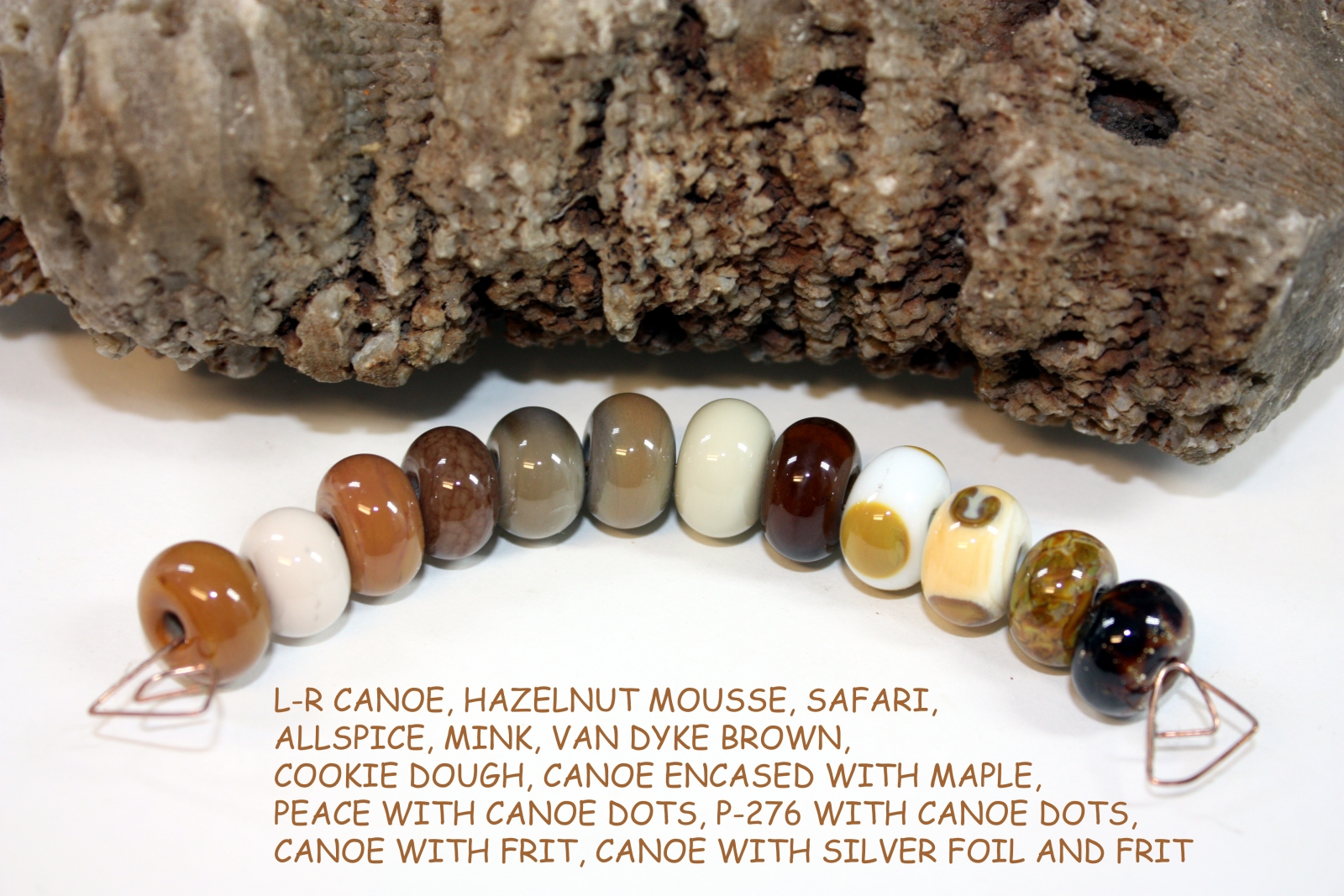
Yep, there is still more...Messy Color™ Chrysalis
MESSY COLOR™ 462 CHRYSALIS LTD RUN
FROM LEFT TO RIGHT:
MESSY COLOR™ 462 CHRYSALIS LTD RUN
MESSY COLOR™ 443 SPEARMINT LTD RUN
MESSY COLOR™ 449 KRYPTONITE
EFFETRE O-516 OPALINO NILE GREEN
MESSY COLOR™ 462 CHRYSALIS LTD RUN ENCASED WITH MESSY COLOR™ 413 PEACOCK GREEN
MESSY COLOR™ 835 PEACE WITH MESSY COLOR™ 462 CHRYSALIS LT RUN DOTS
EFFETRE P-276 DARK IVORY WITH MESSY COLOR™ 462 CHRYSALIS LTD RUN DOTS
MESSY COLOR™ 462 CHRYSALIS LTD RUN WITH THAT FRIT GIRL KALERA’S ROMANCE FRIT BLEND
MESSY COLOR™ 462 CHRYSALIS LTD RUN WITH SILVER FOIL WITH GLASS DIVERSIONS KIWI SQUEEZE FRIT BLEND
Chrysalis melted smooth and was not stiff. No shockiness or bubbles while melting. My bead turned out opaque and very, very close in color to Kryptonite, but I would say a bit more green than Kryptonite. It is gorgeous encased with Peacock Green. The frits and silver foil I used on it turned out beautiful. It does appear to be a unique color to the 104 palette. It did not react with any of the other colors I used with it.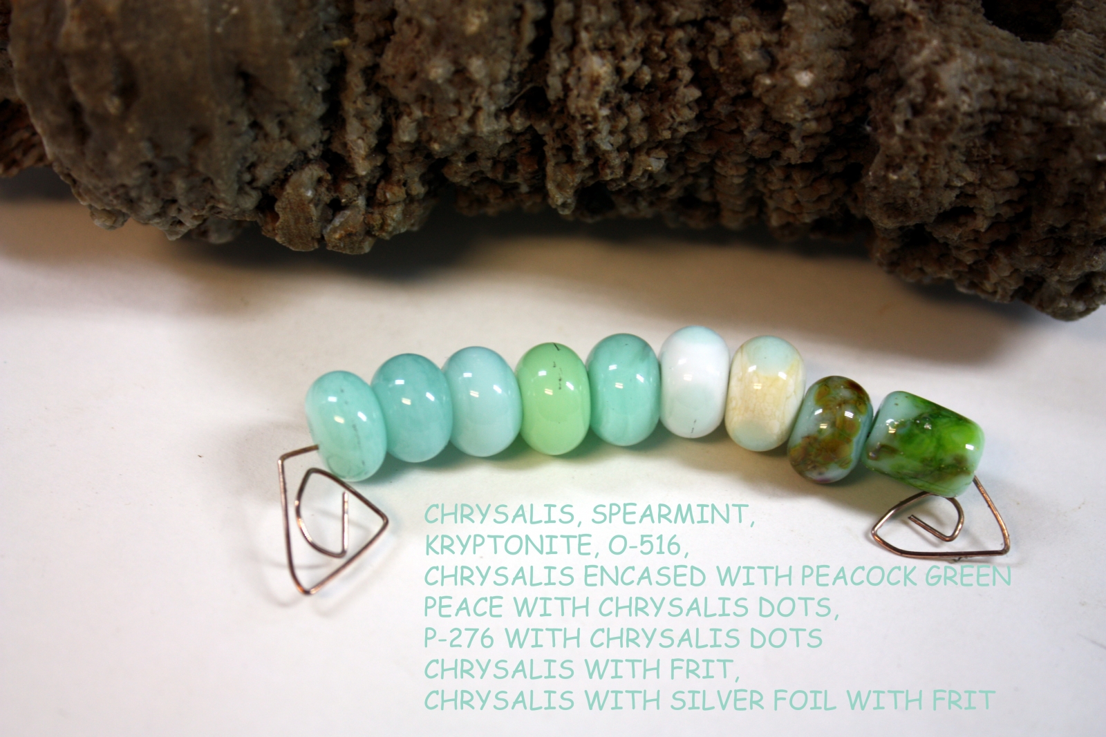
Now comes Messy Color™ Spooky
MESSY COLOR™ 825 SPOOKY LTD RUN
FROM LEFT TO RIGHT:
MESSY COLOR™ 825 SPOOKY LTD RUN
MESSY COLOR™ 806 CIRRUS
MESSY COLOR™ 859 MARSHMALLOW
EFFETRE O-504 OPALINO WHITE
MESSY COLOR™ 825 SPOOKY LTD RUN ENCASED WITH MESSY COLOR™ 121 GARNET LTD RUN
MESSY COLOR™ 101 MARASCHINO WITH MESSY COLOR™ 825 SPOOKY LTD RUN DOTS
EFFETRE P-276 DARK IVORY WITH MESSY COLOR™ 825 SPOOKY LTD RUN DOTS
MESSY COLOR™ 825 SPOOKY LTD RUN WITH THAT FRIT GIRL KALERA’S ROMANCE FRIT BLEND
MESSY COLOR™ 825 SPOOKY LTD RUN WITH SILVER FOIL WITH DOUBLE HELIX TRITON FRIT
Spooky melted nicely, no shockiness, but I did get some bubbles. It appears a bit more golden white to my eye than Marshmallow and more opaque than Cirrus. I do believe it fumed a bit with the silver foil, I do want to try just some foil without the frit to see what it does.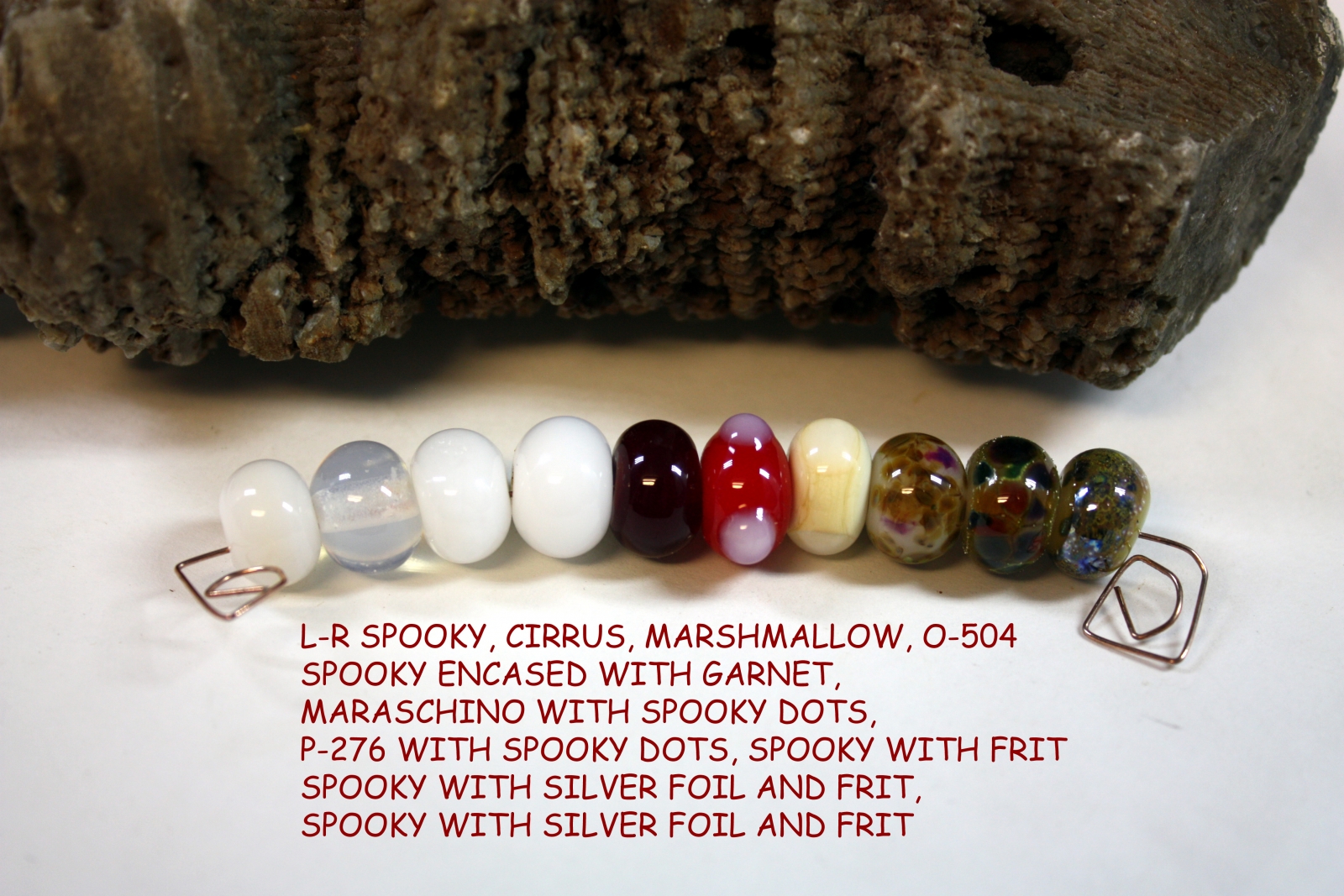
Introducing...Messy Color™ Monarch
MESSY COLOR™ 216 MONARCH LTD RUN
FROM LEFT TO RIGHT:
MESSY COLOR™ 216 MONARCH LTD RUN
MESSY COLOR™ 207 DAFFODIL LTD RUN
MESSY COLOR™ 241 CREAMSICLE
MESSY COLOR™ 215 BUTTERNUT LTD RUN
EFFETRE S-412 DARK YELLOW ORANGE
MESSY COLOR™ 209 ALLEY CAT LTD RUN
MESSY COLOR™ 216 MONARCH LTD RUN ENCASED WITH MESSY COLOR™ 825 SPOOKY LTD RUN
MESSY COLOR™ 216 MONARCH LTD RUN ENCASED WITH MESSY COLOR™ 211 ORANGE CRUSH LTD RUN
MESSY COLOR™ 835 PEACE WITH MESSY COLOR™ 216 MONARCH LTD RUN DOTS
EFFETRE P-276 DARK IVORY WITH MESSY COLOR™ 216 MONARCH LTD RUN DOTS
MESSY COLOR™ 216 MONARCH LTD RUN WITH THAT FRIT GIRL KALERA’S ROMANCE FRIT BLEND
MESSY COLOR™ 216 MONARCH LTD RUN WITH SILVER FOIL WITH GLASS DIVERSIONS PHOENIX FRIT MIX
Monarch melted smoothly with no shockiness or bubbles. It is a new color to the 104 palette. It was similar to Alley Cat, but a bit lighter. I did get a darker orange outline on one of the dots on the P-276 Dark Ivory, but not on all of them. Monarch encased with Spooky was a very pretty pale pink color.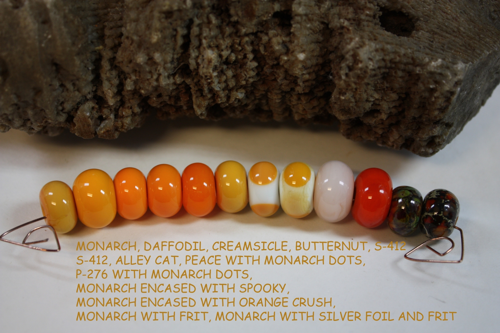
Guess what's next...Messy Color™ Poolside
MESSY COLOR™ 553 POOLSIDE LTD RUN
FROM LEFT TO RIGHT:
MESSY COLOR™ 553 POOLSIDE LTD RUN
MESSY COLOR™ 534 AEGEAN
MESSY COLOR™ 513 GALAPAGOS LTD RUN
MESSY COLOR™ 590 GREAT BLUEDINI
MESSY COLOR™ 522 TUSCAN TEAL LTD RUN
MESSY COLOR™ 402 CELADON ENCASED WITH MESSY COLOR™ 553 POOLSIDE LTD RUN DOTS
MESSY COLOR™ 835 PEACE WITH MESSY COLOR™ 553 POOLSIDE LTD RUN DOTS
EFFETRE P-276 DARK IVORY WITH MESSY COLOR™ 553 POOLSIDE LTD RUN DOTS
MESSY COLOR™ 553 POOLSIDE LTD RUN WITH THAT FRIT GIRL KALERA’S ROMANCE FRIT BLEND
MESSY COLOR™ 553 POOLSIDE LTD RUN WITH SILVER FOIL WITH VAL COX ORIENTAL BLUE FRIT BLEND
Poolside melted with some bubbles, but no shockiness. I find it to be a unique color to the 104 palette, slightly less saturated than Aegean. I did get a little color reaction with the dots of Poolside on P-276 Dark Ivory, there is a darker ring of Poolside at the edges of the dots.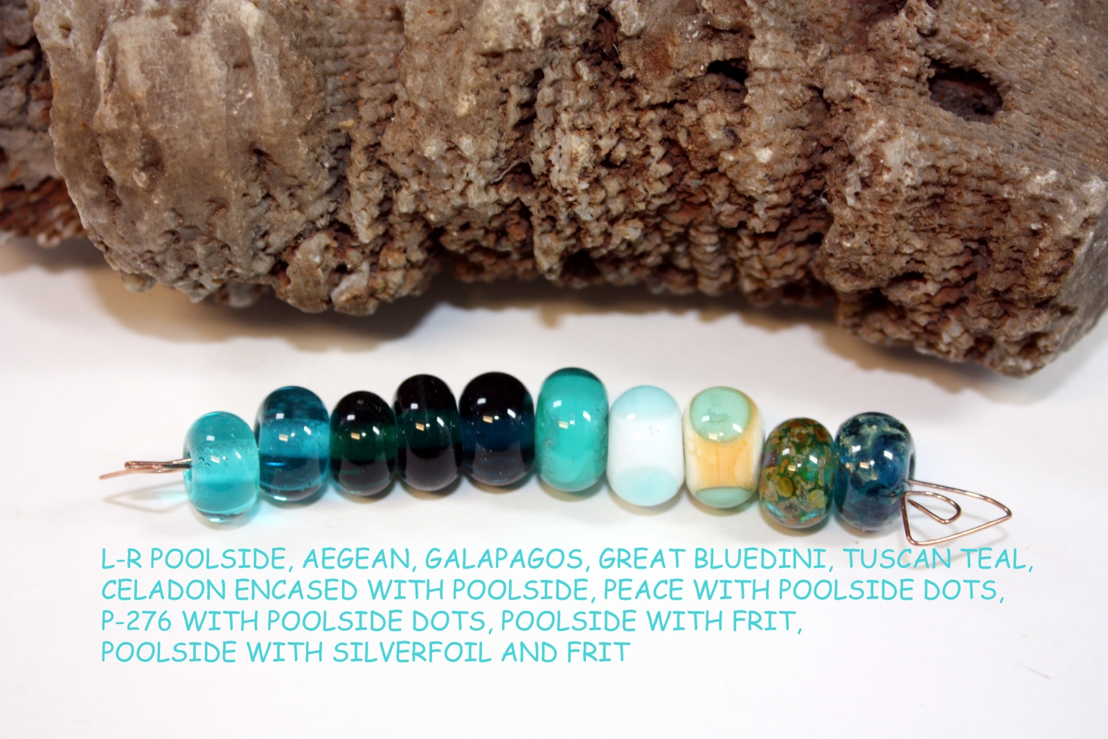
Another great new color Messy Color™ Venus
MESSY COLOR™ 911 VENUS LTD RUN
FROM LEFT TO RIGHT:
MESSY COLOR™ 911 VENUS
MESSY COLOR™ 915 PINK CHAMPAGNE
MESSY COLOR™ 906 SAKURA LTD RUN
MESSY COLOR™ 909 CHARLOTTE LTD RUN
MESSY COLOR™ 921 BLUSH
MESSY COLOR™ 904 GELLYS STY ENCASED WITH MESSY COLOR™ 911 VENUS LTD RUN
MESSY COLOR™ 835 PEACE WITH MESSY COLOR™ 911 VENUS LTD RUN DOTS
MESSY COLOR™ 911 VENUS LTD RUN WITH THAT FRIT GIRL KALERA’S ROMANCE FRIT BLEND
MESSY COLOR™ 911 VENUS LTD RUN WITH SILVER FOIL WITH GLASS DIVERSIONS APRICOT NECTAR FRIT BLEND
Venus is a beautiful shade of transparent coral. It is slightly lighter than Sakura. I didn’t have any trouble with shockiness, but did get a lot of bubbles. The problems with the bubbles was much better working it cooler, further out in the flame. It is a very pretty color and well worth the time to work it slower.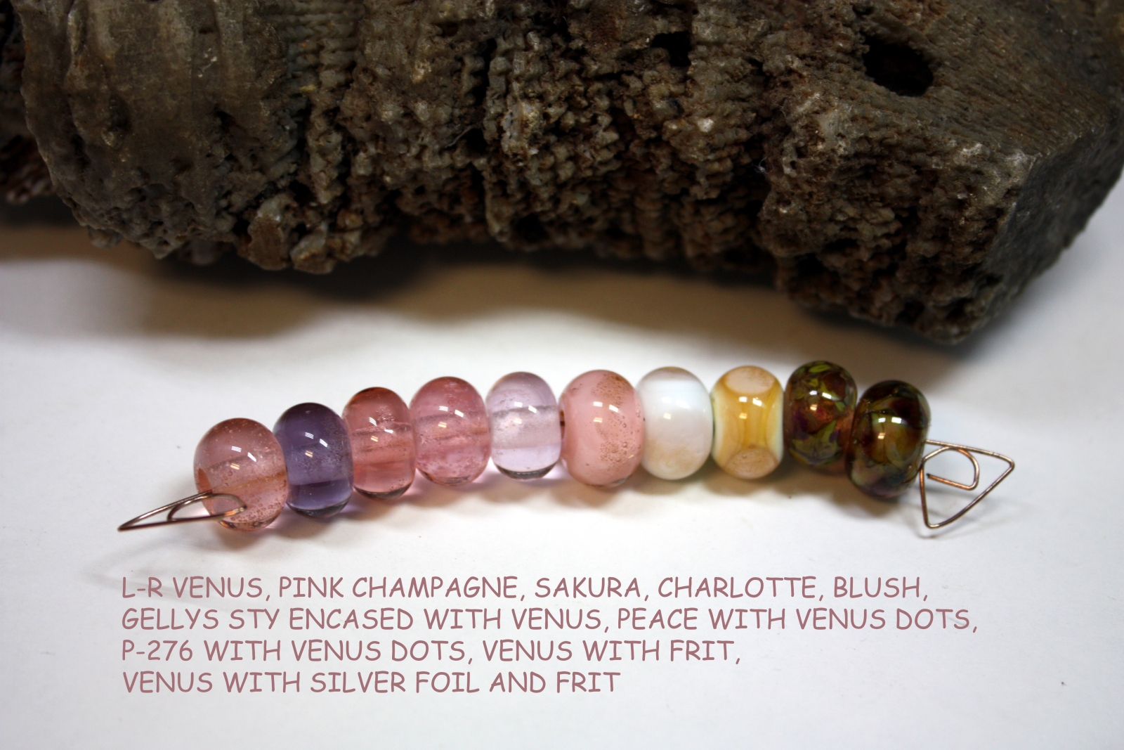
And the last one that I have completed to date...Messy Color™ Jelly Bean
MESSY COLOR™ 461 JELLY BEAN LTD RUN
FROM LEFT TO RIGHT:
MESSY COLOR™ 461 JELLY BEAN LTD RUN
MESSY COLOR™ 450 CHARTREUSE LTD RUN
MESSY COLOR™ 451 INCHWORM LTD RUN
MESSY COLOR™ 487 POISON APPLE
MESSY COLOR™ 461 JELLY BEAN LTD RUN ENCASED WITH MESSY COLOR™ 453 PERIDOT LTD RUN
MESSY COLOR™ 835 PEACE WITH MESSY COLOR™ 461 JELLY BEAN LTD RUN DOTS
EFFETRE P-276 DARK IVORY WITH MESSY COLOR™ 461 JELLY BEAN LTD RUN DOTS
MESSY COLOR™ 461 JELLY BEAN LTD RUN WITH THAT FRIT GIRL KALERA’S ROMANCE FRIT BLEND
MESSY COLOR™ 461 JELLY BEAN LTD RUN WITH SILVER FOIL WITH MESSY COLOR™ 505 FRENCH BLUE FRIT
Jelly Bean melted like butter and without shockiness or bubbles. Jelly Bean makes me think of a chartreuse version of Cirrus. It is definitely unique to the 104 color palette. Jelly Bean is a hit with me. I don’t know if it was the frit reacting with the silver foil or a combination of the frit, silver foil and Jelly Bean, but the French Blue frit developed a cool little bullseye in each frit dot.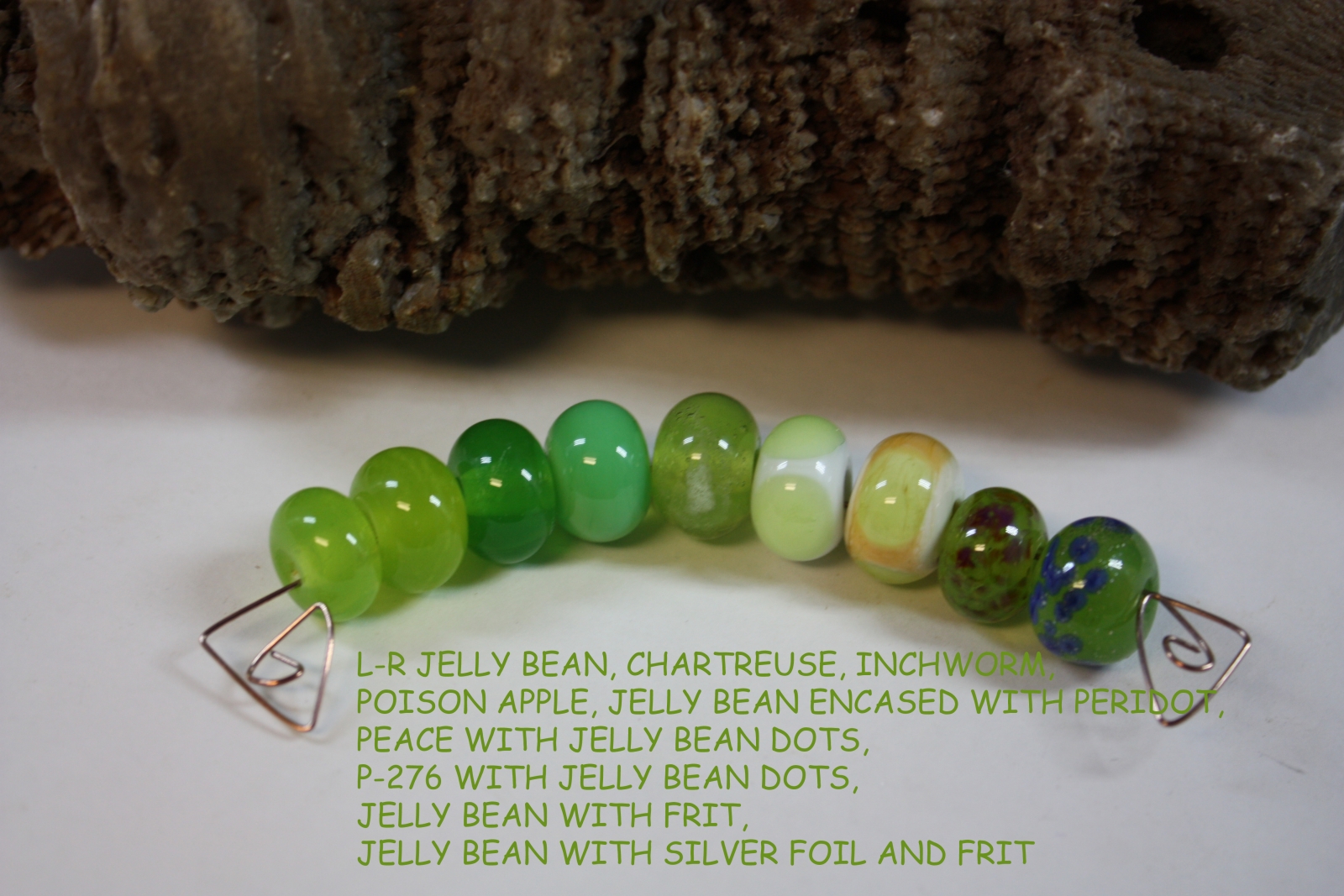

Comments
thanks
thanks
You're welcome.
You're welcome.
Creation is Messy Color Testing | Paula Dawne Creations
If some one desires expert view about running a blog then i suggest
him/her to go to see this webpage, Keep up the good job.
Feel free to visit my blpg post :: balayı villaları
Creation is Messy Color Testing | Paula Dawne Creations
Great work! This is the type of information that are supposed to be shared across the web.
Shame on the seek engines for no longer positioning this publish
upper! Come on over and talk over with my web site . Thank you =)
Accidentally i have come
Accidentally i have come across this website and this post deals with the details regarding the messy color testing ideas. We can see different color combinations over here and the real estate companies Tunnel Hill details provided here are really new to me since I am not familiar with this topic. Keep sharing more such updates over here.
I'm thrilled to see this
I'm thrilled to see this color testing from Creation is Messy! The TARDIS shade looks absolutely cheap real diamond rings stunning and versatile. The blog's detailed description and the beautiful glass samples are impressive. Can't wait to see more of your creations and blogs! Keep up the fantastic work!
hai
I absolutely loved reading about your glass testing for Creation is Messy! The colors look stunning, especially the TARDIS LTD RUN. Your passion and dedication shine through, and I nashvilles tax related law can't wait to see more of your beautiful creations. Keep up the fantastic work!
health
hsuihhhhhhhhhhhhhhhhhhhhhhhhhhhhhhhhhhhhhhhhhhhhhhhhhhhhhhhhhhhhhhhhhhhhhhhhhhhhhhhjjjjjjjjjjjjjjjjjjjjjjjjjjjjjjjjjjjjjjjjjjjjjjjjjjjjjjjjjjjjjjjjjjjjjjjjjjjjjjjjjjjjjjjjsddddddddddddddddddddddddddddddddddddd
health
xvdvdfbhhhhhhhhhhhhhhhhhhhhhhhhhhhhhhfdmmmmmmmmmmmmmmmmmmmmmmmmmmmmmmmmmmmmmmmmmmmmmmmmmmmmmmmmmm healthmmmmmmmmmmmmmmmmmmmmmmmmmmmmmmmmmmmmmmmmmmmmmmmmmmmmmmmmmmmmmm
Health is a holistic concept
Health is a holistic concept that requires a balanced approach to physical, mental, and social well-being. By prioritizing proper nutrition, regular exercise, mental health care, preventive measures, and social connections, individuals can achieve and maintain optimal health. This comprehensive approach to health not only enhances quality of life but also contributes to longevity and resilience in the face of life’s challenges. Investing in health is a lifelong commitment that yields invaluable rewards, allowing individuals to lead fulfilling and productive lives.Preventive health measures are proactive steps taken to reduce the risk of developing diseases and health conditions These measures include vaccinations, regular health screenings, and lifestyle modifications. Vaccinations protect against infectious diseases like influenza, measles, and hepatitis, contributing to overall public health.Regular health screenings, such as blood pressure checks, cholesterol tests, and cancer screenings, help detect potential health issues early, when they are most treatable. For instance, mammograms and colonoscopies can detect cancers at an early stage, significantly improving treatment outcomes.
Irvin Robertson
Insightful article on the Six Commandments of Search Implementation. Clear, practical guidance that boosts discoverability, perfectly applied to center promotion on Drive Ryan Gosling Jacket campaigns. Highly recommended for brands.
Post new comment